


The Strategic Impact of Branded Presentation Design
You only have a few moments to establish trust and confidence; are you maximizing your impact?

I’ve spent the past week working with a brand new team–new business unit, new faces, new talent.
It’s been a fantastic, and humbling, opportunity to learn not only a new side of our enterprise, but also the ways of working that have gotten this team where they are today.
One of my “day 1” deliverables included doing an extensive assessment and shareouts with leadership. The content was easy, but what resonated with these leaders? I quickly I realized that each member of the team presented information in a different way. The worst part? Hearing a leader say “I don’t see the point of this presentation.” in response to someone’s deck. Ouch.
So, step one: establishing a consistent, intentional design language for the product portfolio I’ll be creating.
Beyond Aesthetics
The average executive spends 23 hours per week in meetings where the battle for attention is fierce and unforgiving. Your aren’t just competing against other agenda items—it’s competing against emails, Teams notifications, and the mental fatigue that accompanies decision-making marathons.
While some may think that a branded design language for presentations is mere window dressing, it’s not. It’s a strategic framework that streamlines information processing, establishes credibility, and accelerates decision velocity. When consistently applied, it transforms presentations from information dumps into persuasion engines.
The Science Behind Presentation Effectiveness
The human brain processes visual information 6x-to-600x faster than text. For executives making rapid decisions, this processing advantage is critical. Microsoft research suggests you have approximately 8 seconds to capture executive attention before minds begin to wander.
More compelling is data from Corporate Visions showing presentations with consistent visual branding are 43% more likely to be perceived as credible by executive audiences. This “credibility premium” can be the difference between your proposal moving forward or languishing in the “interesting but not urgent” category.
When McKinsey analyzed presentation effectiveness across 1,500 client engagements, they found standardized design systems reduced cognitive load on audiences and increased key message retention by 29%.
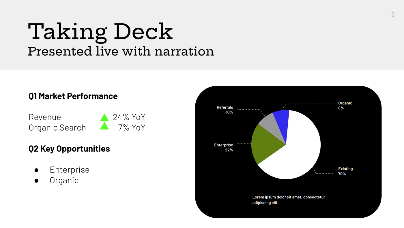
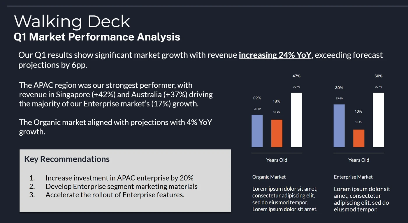
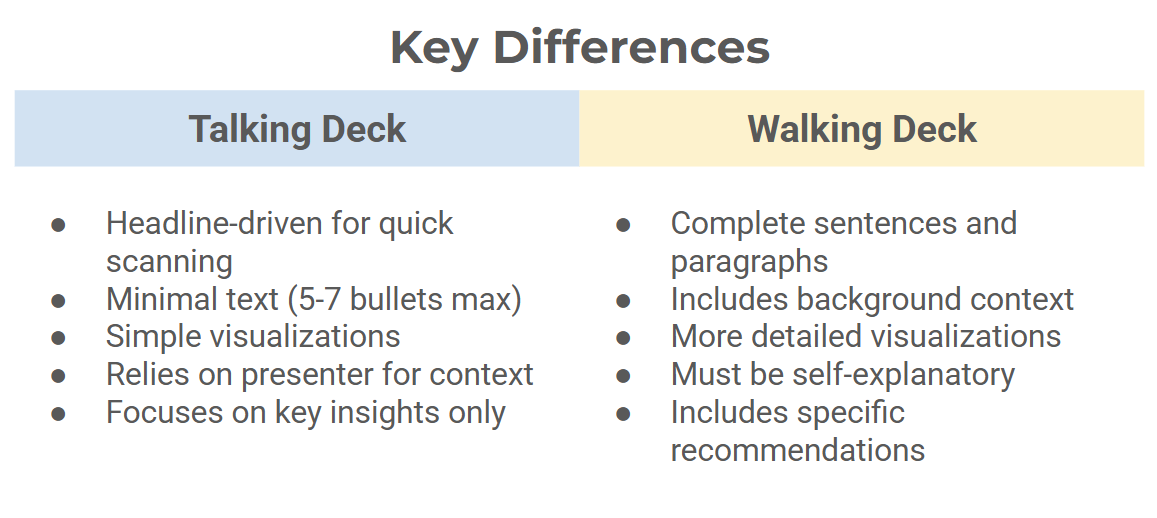
Talking Decks vs. Walking Decks
Understanding the distinction between “talking decks” (presented live) and “walking decks” (consumed independently) is crucial for maximizing impact.
Talking decks support verbal narration with minimal text (5-7 bullets maximum), emphasize visual hierarchy through size and contrast, and prioritize simplicity. They’re designed to complement—not compete with—the presenter’s voice.
Walking decks must stand alone with sufficient context, use complete sentences in a narrative flow, and include necessary data and supporting evidence. While still visually consistent, they’re information-dense enough to be understood without human context.
I’m a big fan of the concept of a Living Document with multiple versions of the same kinds of information and then pull the right kind of slide for the audience.
- Quick chat with leadership? Snag the talking slide to throw up while you chat.
- Sitting down for a deep dive with the tactical team? Grab the walking deck to pre-read and analyze together.
A common failure mode is creating hybrid decks that serve neither purpose effectively. As former Amazon executive Colin Bryar notes, “When you optimize for both purposes, you optimize for neither.”
Three Dimensions To Your Brand Language
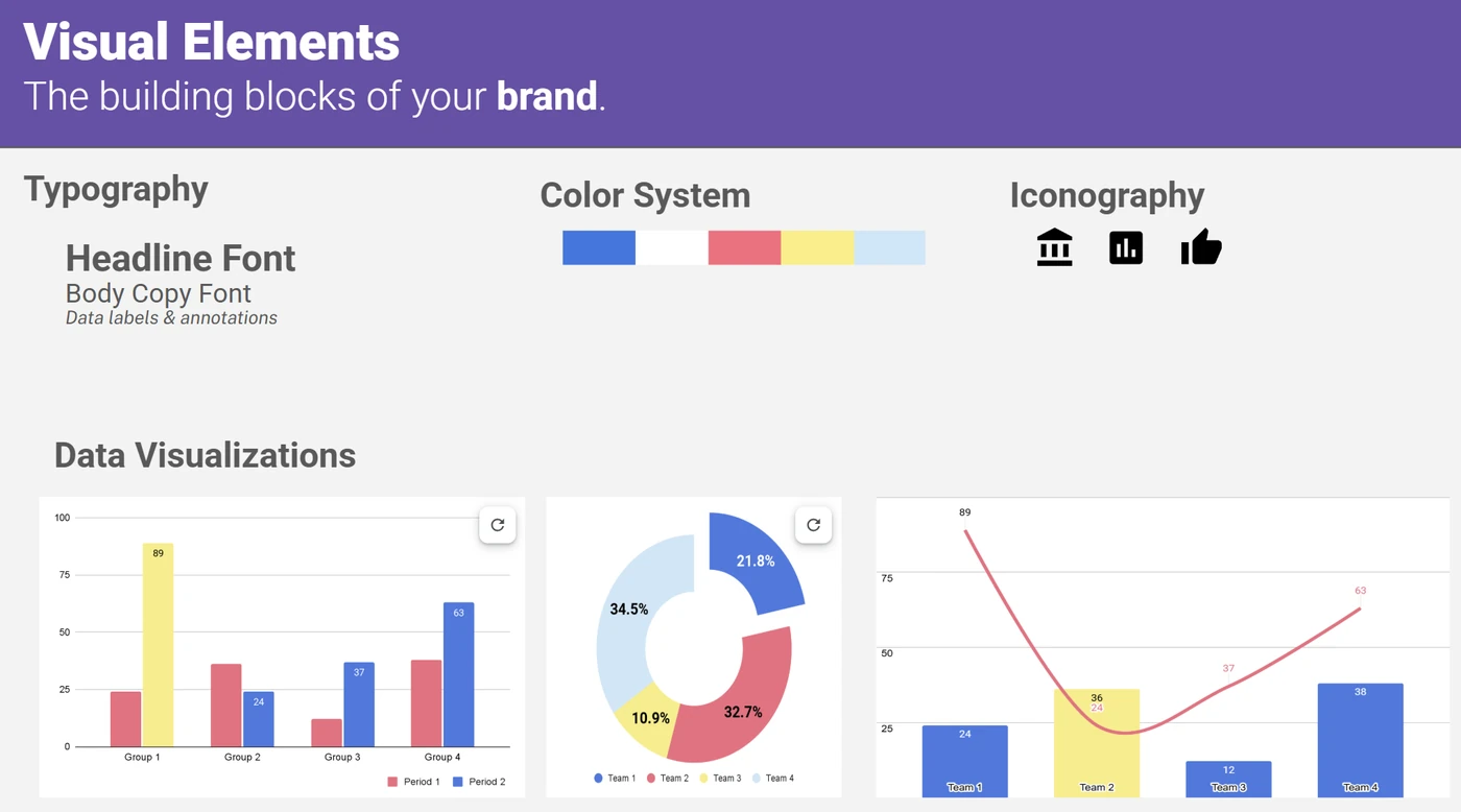
Visual elements
Typography, color palette, iconography, and data visualization styles
Unless you have specific requirements, opt for fonts that are built-in to your presentation tool. Aptos in the latest version of PowerPoint, Roboto in Google Sheets, and Liberation in OpenOffice are baselines as you never have to worry about a missing font. If you’re having trouble figuring out a color palette, try ColorSupply. You can quickly ideate and see how colors look and feel together for the emotion you’re trying to convey. I recommend having at least 4-5 colors in your pallette if you represent data frequently. Having a brighter color to “call attention” and draw your audience’s eye is helpful in guiding the story.
Structural patterns
Consistent slide titling, information hierarchy, and section indicators
Similar to web design frameworks, consistent slide design reduces mental fatigue and creates a consistent behavior on where the audience should focus their attention.
Narrative frameworks
Standardized problem-solution formats and call-to-action structures
There are several storytelling frameworks out there. McKinsey’s 7S framework and the SCR|SCQA provide modular foundations so you can build the depth and bredth necessary for your message.
- Start small. Utilize templates for your most common presentation types: status updates, investment proposals, and strategy reviews.
- Document guidelines. Impose constraints that force focus, like limiting to 10 slides, using a single-sentence headline structure, or requiring visual support for every data point. This becomes your “presentation playbook.”
- Iterate based on feedback. Regularly gather feedback on what’s working and refine your system based on real presentation outcomes.
What does this look like in practice?
The goal isn’t creative limitation but cognitive efficiency. As Netflix’s presentation design team discovered, reducing design variables by 60% increased speed-to-decision by 41%.
Branding Example
Here’s an example (borrowed and anonymitized with love) of where branding can go astray with inconsistent color, design, and flow.
Ineffective branding example
- Inconsistent colors and color intent (is green good and yellow bad?)
- Inconsistent fonts and difference between heading, body, and augmenting

Effective branding example
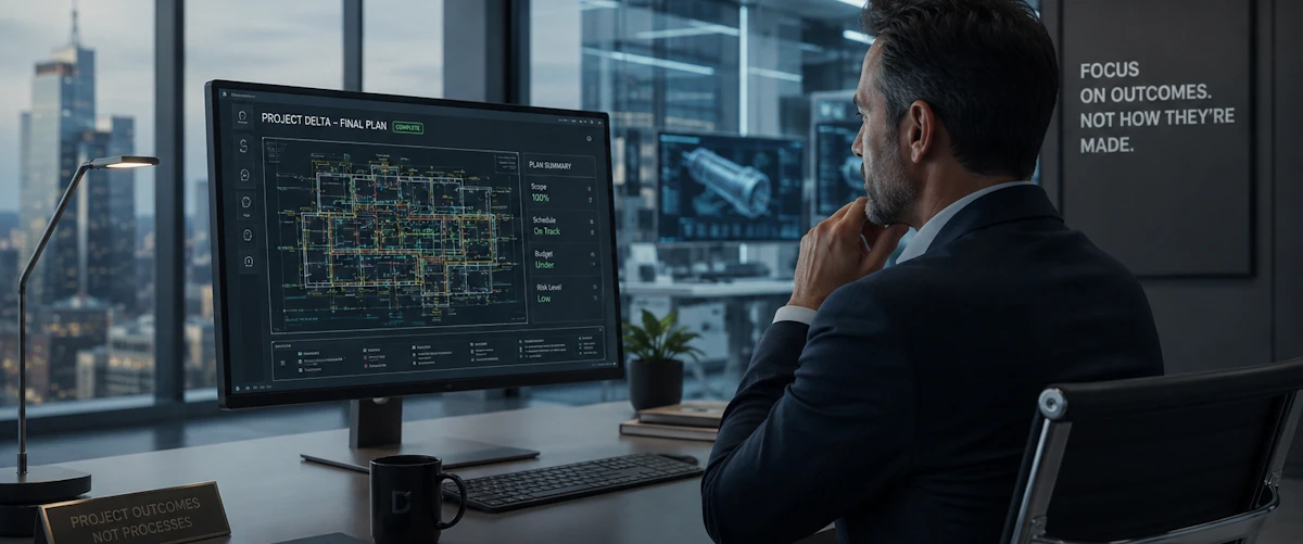
- Consistent, “at a glance” callouts with BANs (big ass numbers)
- Talking points over duplicative details
- Optional: Having a consistent “status” indicator on the slide for project state is also effective. I tend to use a green, yellow, or red “circle” on the top right

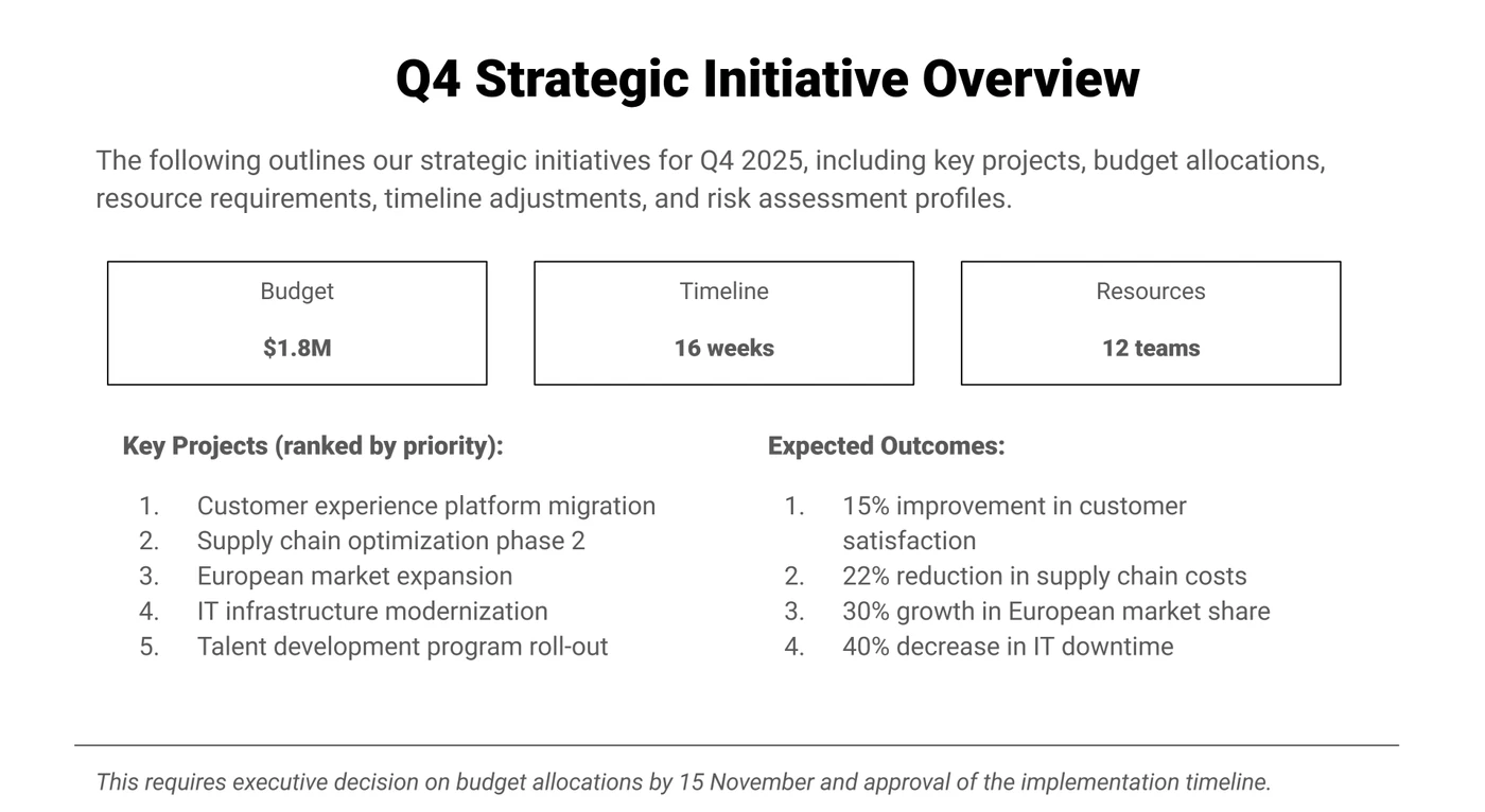
Leadership Shareout Example
Here’s an example of how having an unfocused brand and where trying to create a “hybrid” deck can lead to disarray.
Ineffective design example
- Unsure where to start, content is all over the place
- Additional details blurs line between core enterprise outcomes and run the business metrics
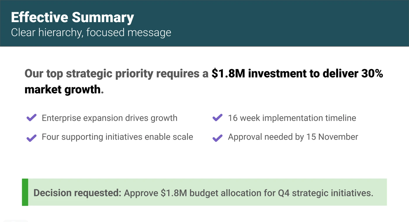
Effective design example
- Clear, concise call to action
- Visual design guides eye flow
- Limited details (more can be in the appendix, follow-up materials, or part of the talk track)
Conclusion: Measuring Impact
The ROI of branded presentations shows up in decision velocity, implementation clarity, and perception metrics. Track how quickly proposals move from presentation to action, survey stakeholders on message clarity, and monitor the “resale” of your ideas through the organization.
Your Branded Advantages
- Visual heirarchy through consistent use of color, typography, and spacing creates clear visual priorities that guide the viewer’s attention.
- Cognitive efficiency through predictable patterns that reduce mental effort needed to process information, allowing focus on content rather than format.
- Professional perception through consistent branding that significantly increases perception of competence and attention to detail.
8-Second Summary Principles
- One clear message by focusing on the single most important takeaway. What’s the one thing you need them to remember?
- Decision-first format by making the required decision or action explicit and impossible to miss.
- Visual priority utilizing size, color, and whitespace to create a deliberate viewing sequence for the eyes to follow.